

Sammy’s Sandcastles Microsite
When you need the perfect summer getaway home, look no further than Sammy’s Sandcastles! Sammy Seagull and his team of highly trained some of the most experienced sand sculptors out there to help bring the castle of your dreams to life!


The Right Tools For the Job

This project started on a rather exciting note. I was given two random slips of paper and the titles of two design podcasts, The Clinch and Built on Sand, by 99% Invisible. I was tasked with listening to both podcasts in their entirety and taking notes for future reference.
To sum them up, the main topic of The Clinch was “Romance, Representation, and Reality,” while Built on Sand was about “New Ideas and Finding Solutions!” I highly recommend that you take some time to give them a listen for yourself. They helped me broaden my understanding of the foundations of design as a whole and how to overcome the boundaries and standards that the industry and general public have assimilated over time.
The next step of the process was to begin brainstorming ideas for our microsites using each of the topics covered in the podcasts. “Romance” and “Sandcastles,” huh? I knew I wanted to have some fun on the project, so I tried to think of original characters and species I could whip up to represent my brand. “Speed Dating Night For Animals” was the first contender out of the gate. It posed the idea of a website that helped animals, carnivores and herbivores alike, go on a three-minute speed date with another animal in hopes that they would be introduced to the love of their life “before rushing into work with your morning coffee the next day!” The main problem with going forward with this idea was that it seemed a little too broad, as told by peers. However, there was still one more contender left to go into the ideation ring. What is now known as “Sammy’s Sandcastles” was then titled “Speedy Seagull Sandcastle Sculptors.” As you can tell, my love for titles with alliterations is still going strong and probably will for some time! It piqued the interest of my fellow designers, and I was more than ready to jump on the project.
Before I began tackling the design and layout of the microsite, I conducted some research that I could use in my visual language. I was compelled to have the color palette be inspired by those you would see when visiting the beach, having it start with daytime colors on the home page and slowly progress across to nighttime colors as the pages progressed on the navigation bar. Finding the perfect balance between the radiant yellows and oranges and the cool blues was vital to keep a consistent theme across the site and ensure legibility for those who are visiting and looking to buy their sandcastle.

Building a Strong Foundation

After completing my visual language research, we get to our favorite part of the UX/UI experience, wireframes! These wireframes were to define the layout of our content on desktops. The structure of our mobile sites would be determined once we had a robust design for desktops. I wanted each page to be open to allow all content to have its elbow room and breathe. Additionally, this is the phase where I began to map out where I wanted my illustrations of Sammy to be located on each page. These spaces are identified by the large circles in each of the headers. However, those illustrations would be developed after completing the site itself, and I will briefly discuss my process of creating those later on.

My first draft had a cornucopia of details to help immerse viewers into the beach experience and practically transport them onto the shore, feeling the warmth of the sun shining down on you and glistening across the ocean and turning it into diamonds. This chaotic abundance is evident on the homepage, where I decided to have seashells acting as borders to break the page into its three primary sections. Unfortunately, this worked against me as feedback suggested that it made the page seem too busy and distracting, taking away from the text that held a higher hierarchy when it came to using the site. This feedback was also applicable to my shop page, where I had a picture of seagull footprints in the sand set as the background behind the catalog of sandcastles. I admit that I can be a little excessive when it comes to adding details to projects, but this feedback encouraged me to have more faith in the design itself rather than unnecessary amenities.
When it came time to begin brainstorming the design of our microsites on mobile devices, I did not initially consider the legibility and clickability of some of the content. I tend to whip out my storytelling side when it comes to writing, especially for a creative assignment, and it came back to bite me big time. There was an excessive surplus of reading material for the catchy captions of the sandcastles in the catalog, and paired with the size of the font; it was near-impossible to read! I look back on this period of my design career fondly, as it was the first time I had been tasked to create content for mobile screens rather than a full-blown desktop.
The penultimate design proved to be much stronger than the last and was met with positive feedback, but there were still some complaints about the vast color palette of my site. Regardless, I stood firm with my decision, for the palette held a significant value for me and my fond memories of the beach before COVID, and I wanted to give that feeling to audiences as well. This revised design also came with the addition of a “reviews” page! Initially, I planned to have a third illustration of Sammy crammed in the top right corner of the “payment’ page, but it began to look messy and out of place the further along in the process I got. The addition of the review page provided the perfect opportunity to move that illustration to the review page, as it lined up with the thematic layout previously seen on the “home” and “shop” pages. Unfortunately, this page was the most difficult one to prototype. I wanted the rating system to appear in the form of starfish, and I needed to have the proper number pop up when activated. My workaround to make my vision easier was to create five additional review pages, each with the designated number of stars that the customer left in their review (1-5 starfish and a base page for no input). Thankfully, this solved my problem for the time being and responded as I had hoped it would, after much time properly linking pages to one another.
Ain’t No Bird-Brain
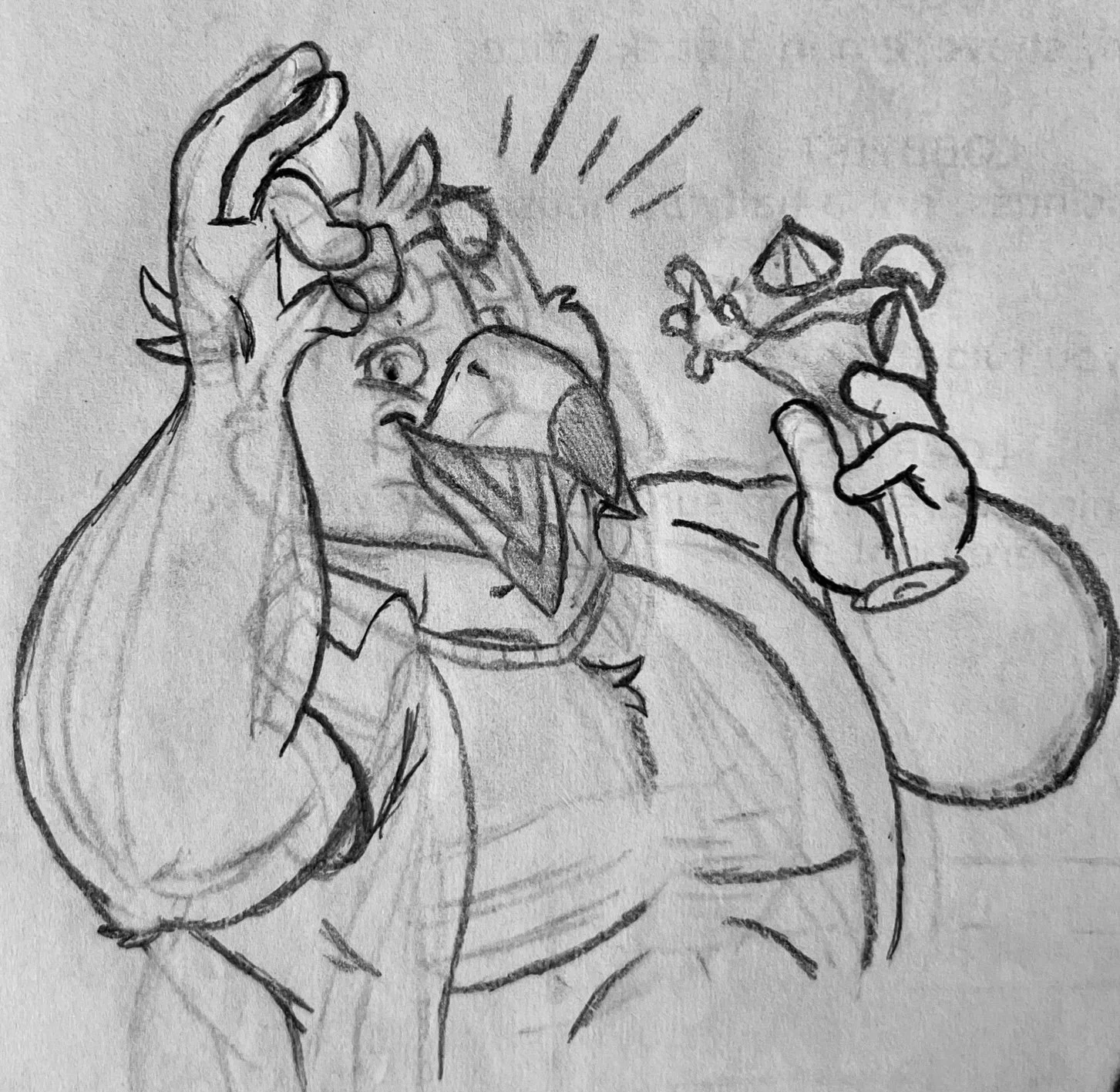


With the microsite finally complete, we come to the final and my favorite part of the process: designing Sammy Seagull! Rather than have him be a hard-hearted sailor like I had initially planned, I decided to have him be a surfer who knew the beach like the back of his hand…er…wing. While a bit of an airhead, he was no idiot. He knows the sandcastle industry, stays on top of the latest trends, and knows how to brand himself as the friendly, charismatic, and trustworthy seagull that you see on the company’s website.
I wanted him to have three distinct poses for the three pages that he would be featured on and encapsulate the purpose of each one. The home page: welcoming and laid back. The shop page: confident and robust. The review page: compassionate and sociable. Once I was satisfied with how they looked, I moved them into Photoshop, where I refined the linework and added some color to bring him to life. For his shirt and its design, I researched some of the hottest (no pun intended) styles that were currently in for the summertime. I wanted to keep it simple yet simultaneously make it flashy and fun. This bird was ready for business with some sleek shades and a shiny gold chain necklace! The only thing left was each of the backgrounds that rested inside the circles behind him. I went with colors that complemented prominent ones on each page, which helped make him POP in the final product.
Designing and prototyping my microsite was no easy feat, but it pushed me out of my comfort zone and got me to explore what goes into creating a functional website for a company, the satisfyingly straightforward navigation throughout the site, and creating a brand that resonates with audiences. You can test both versions of the microsite for yourself by following the links below. Who knows? You might even want a glorious sandcastle of your own for the upcoming season!
